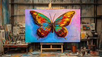


A wall can be beautifully painted and thoughtfully furnished, yet still feel unfinished. Often, what it needs is not more decor, but an image with presence - a piece that brings color, memory, and a point of view into the room. Fine art paper prints offer that feeling in an approachable format, preserving the character of an artist’s work while giving a home the warmth of something chosen with care.
For the first-time art buyer, a paper print can be an easy beginning. For a seasoned collector, it can be a considered addition to a gallery wall, a guest room, or a quiet corner that deserves its own moment. The difference lies in choosing a print that feels alive in your space, not simply one that fills an empty rectangle.
What Makes Fine Art Paper Prints Different?
Fine art paper is selected for the way it receives an image. Its surface, weight, and finish affect how color settles into the paper and how much detail remains visible from up close. A well-made giclée print on archival-quality fine art paper can hold subtle shifts in tone, deep shadows, crisp edges, and the soft variations that give artwork a sense of atmosphere.
This is a meaningful distinction from a thin, glossy poster made for quick reproduction. Posters can be fun and useful, especially for temporary spaces or casual displays. Fine art paper prints are made for a longer relationship with the image. They are often printed with pigment-based inks and designed to retain their color and clarity when displayed and cared for properly.
The paper’s finish also shapes the experience of the work. A matte or softly textured paper can make a nature photograph feel more tactile and intimate. It can soften glare in a bright room and allow rich color to read with a calm, painterly quality. A smoother paper may be the better choice when a work depends on fine lines, sharp botanical detail, or saturated fields of color.
Neither choice is automatically better. It depends on the artwork, the light in the room, and the mood you want to create.
Choosing Art for the Way You Live
A print does not have to match every pillow, rug, or paint color. In fact, art often feels more lasting when it introduces a slightly unexpected note. A vivid orchid against a soft background can bring welcome energy to a neutral bedroom. A wildlife image can give an office a sense of stillness and open space. A richly colored abstract composition may become the visual center that pulls a living room together.
Start with the feeling you want the room to hold. If the space is where you begin and end the day, look for an image that offers a pause: layered blues, quiet natural forms, or a composition with room to breathe. In an entryway or dining area, you may want something more immediate - a print with bold color, sculptural shapes, or a subject that invites conversation.
It is also useful to consider sightlines. What do you see from the sofa, the bed, or the chair where you drink your coffee? The right artwork rewards repeated looking. It does not need to reveal everything at once, but it should remain interesting after the first impression.
Let the Scale Do Some Work
One of the most common reasons artwork feels underwhelming is not the image itself. It is scale. A small print floating alone over a wide sofa can look hesitant, even when the artwork is beautiful. A larger print, or a thoughtfully arranged group of smaller works, gives the wall a more intentional presence.
Before choosing a size, use painter’s tape to mark the approximate dimensions on the wall. Step back from the distance where you will usually view it. This simple exercise can prevent a print from arriving smaller than the room needs.
For a single work above furniture, aim for a visual relationship rather than a strict formula. The print should feel connected to the piece below it, with enough width to hold its own. In a narrow hallway, stair landing, or small office, a more modest size can be exactly right. Intimacy has its place.
Framing Is Part of the Artwork’s Presence
Fine art paper prints become more finished and more personal when framed. The frame does not need to compete with the image. Its job is to give the work a clean boundary, protect the paper, and help it belong in the room.
Natural wood frames pair beautifully with botanical imagery, wildlife photography, and work with warm, earthy color. Black frames can add definition to vivid contemporary art and create a confident contrast against pale walls. White frames tend to feel light and airy, especially around images with soft backgrounds or a restrained palette.
A mat can create breathing room between the image and the frame. It is particularly effective for smaller prints, detailed photography, or works with quiet composition. But a mat is not required. A full-bleed image with a simple frame can feel modern and immediate, especially when the artwork has strong color or bold texture.
If you are framing a print for long-term display, choose materials intended to protect art. UV-filtering glazing can help reduce the effects of sunlight, while acid-free mats and backing help keep the paper from discoloring over time. These details are less visible than the frame, but they support the work quietly for years.
Light Changes Everything
The same print can look dramatically different at noon and after sunset. Natural light often brings out the nuance of a paper surface, but direct sunlight can be hard on any artwork over time. If a wall receives strong, prolonged sun, choose a location nearby rather than directly in the brightest path of the day.
At night, warm picture lights or nearby lamps can make a print feel more dimensional and inviting. Pay attention to glare, especially if the work is framed behind glass or acrylic. A slight adjustment in placement, angle, or lighting can make the image easier to enjoy.
This is where fine art paper has a quiet advantage. Its matte surface often handles ambient light gracefully, creating a softer viewing experience than high-gloss finishes. For rooms with large windows, overhead lighting, or frequent shifts in daylight, that restraint can be especially appealing.
Building a Collection, One Wall at a Time
You do not need to buy all the art for a home at once. In fact, a room often feels more authentic when it develops gradually. Begin with the image that genuinely stays with you. Then let future pieces respond to it through color, subject, scale, or mood.
A collection can be connected without being overly coordinated. Perhaps one print carries the green of a garden, another the rust of a late-summer field, and a third the deep blue of a distant horizon. Together, those works can create a shared atmosphere without looking like a matched set.
This approach works especially well when combining originals and reproductions. An original textured canvas may serve as the focal point in a living room, while fine art paper prints bring related color and natural imagery into bedrooms, hallways, or a home office. At Just Art by John, that mix allows collectors to live with a recognizable artistic point of view across a space while choosing formats that suit each room.
A Thoughtful Gift That Lasts
Paper prints also make meaningful gifts because they leave room for personal interpretation. A flower in full color can mark a new home, a milestone birthday, or a season of change. A serene landscape can offer comfort without needing a long explanation. For someone who values their home, an art print says you noticed the world they are creating around themselves.
When gifting, consider the recipient’s walls as much as their taste. Do they live with warm wood and linen, clean modern lines, or color-filled rooms? A print that complements their surroundings will feel considered from the first day it is hung.
The best artwork does not simply occupy space. It changes the way a space feels when you walk into it. Choose a fine art paper print that gives you something to return to - a color that lifts the room, a natural form that slows the eye, or a small moment of beauty that continues to meet you where you live.