

Table of Contents
- Start With Your Room, Not the Art
- How to Match Art With Wall Color
- The Best Size for Living Room Wall Art
- How to Hang Fine Art at Eye Level
- Choosing Fine Art That Fits Your Interior Aesthetic
- Lighting, Preservation, and Long-Term Care
- Common Mistakes When Choosing Fine Art for a Living Room
- Conclusion
- Frequently Asked Questions
Last Updated: September 29, 2026
Start With Your Room, Not the Art
Most people buy art backwards. They fall for a piece online, bring it home, and then discover it fights with the sofa, the wall color, or the light. Choosing fine art for a living room works better when you start with the space itself.
Start by answering three questions about the room:
- Where will people actually look? That spot is your focal point.
- How much wall space is truly free? Measure it before you shop.
- What is the room's job? A quiet reading corner and a busy entertaining space need different energy.
How to Match Art With Wall Color
Matching art to wall color is simpler than most guides suggest: let the wall recede and the art do the talking. Neutral walls give you freedom. Bold walls demand more care.
Here is the practical rule set:
- White or cream walls: almost any color palette works, so pick art you love.
- Gray or greige walls: warm tones in the art stop the room feeling cold.
- Deep or saturated walls: choose art with contrast, or the piece disappears.
- Patterned wallpaper: go simple. One strong focal point beats two competing ones.
The Best Size for Living Room Wall Art
The best size for living room wall art is one that fills roughly two-thirds to three-quarters of the wall width above a piece of furniture. Too small and the art floats; too large and it crowds the room.
| Wall Situation | Art Width Target | Why It Works |
|---|---|---|
| Above a sofa | 60-75% of sofa width | Anchors the seating area |
| Above a console | 60-75% of console width | Keeps visual balance |
| Narrow wall | Single vertical canvas | Uses height, not width |
| Large empty wall | Two or three smaller pieces | Fills space without one huge buy |
How to Hang Fine Art at Eye Level
Hang fine art so the center of the piece sits at 57 to 60 inches from the floor. That range matches average eye level and is the standard most galleries and designers use.
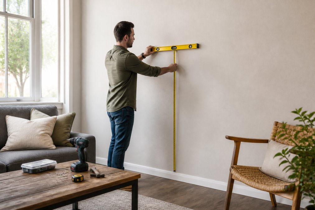
Here is the step-by-step process:
- Measure 57 to 60 inches up from the floor and mark it lightly with pencil.
- Hold the piece against the wall and center it on that mark.
- Mark the top edge, then measure down to the hanging wire or bracket.
- Add that distance below your top mark for the hook position.
- Drill, install the hook, and hang.
- Check with a level and adjust until the top edge is straight.
Choosing Fine Art That Fits Your Interior Aesthetic
Choosing fine art that fits your interior aesthetic comes down to one idea: match the mood, not the furniture. Your style should guide the feeling of the piece, not lock you into a color scheme. Most guides stop at a style checklist. The more useful layer is understanding why a piece changes how a room feels, because that is what you are actually buying.
Read the room's mood before you read the art
Every living room already has a dominant mood, set by light, ceiling height, and how the room is used. Your job is to decide whether the art should reinforce that mood or shift it.
- Low ceilings and dim corners: a piece with a high horizon line or open sky pulls the eye up and makes the room feel taller.
- Bright, south-facing rooms: warm, saturated work holds its own against strong light; pale, low-contrast work can wash out.
- Small rooms: one large piece with a single focal point reads calmer than a cluster of small frames, which adds visual noise.
- Open-plan spaces: art with a strong, simple silhouette reads from across the room; fine detail disappears at distance.
The psychology of color and mood
Color is the fastest lever you have. The effect is not mystical; it comes from contrast, saturation, and temperature working together.
- Cool blues and greens lower perceived energy. They suit reading corners, bedrooms that open to living space, and rooms where you want calm.
- Warm reds, oranges, and yellows raise perceived energy. They suit entertaining spaces and rooms that feel cold or underlit.
- High-contrast palettes (dark against light) create drama and draw the eye first. Use them where you want a focal point.
- Low-contrast, tonal palettes recede. They suit rooms where the art should support the furniture rather than compete with it.
- Earth tones and muted neutrals tend to feel grounded and timeless, which is why they age well in a room you will not repaint often.
Match the medium to the mood
Texture and medium change the feel of a room as much as color does.
- Acrylic and oil paint read bright, smooth, and saturated. They hold up in well-lit rooms.
- Charcoal and graphite feel softer and more intimate. They suit quieter, lower-light spaces.
- Watercolor reads light and airy; it can disappear in a large, bright room unless it is matted generously.
- Fine art prints sit between original painting and mass-produced decor. They are an easy entry point for new collectors and let you test a mood before committing to an original.
Style, translated into a buying decision
- Minimalist decor: one large piece, generous empty wall, low-contrast palette.
- Warm and traditional: landscapes, florals, richer color and texture.
- Modern and clean: abstract work, bold shapes, high contrast.
- Eclectic: mix mediums and sizes, but keep one thread, like color or subject, running through.
This is where a curated collection beats random buying. A nature-inspired set, like Rose Garden or Magic Garden, holds a room together because the pieces already share a mood.


Lighting, Preservation, and Long-Term Care
Where you hang a piece matters as much as what you hang. Direct sunlight fades ink and paint over time, so keep fine art off walls that take harsh afternoon sun. This is the part of the process most guides skip, and it is the part that decides whether a piece looks the same in ten years.
Light: the biggest single threat
Ultraviolet light breaks down pigments and paper. The damage is cumulative and irreversible, which is why prevention beats restoration.
- Keep art off walls that receive direct sun for more than an hour or two a day.
- If you cannot move the piece, use UV-filtering glass or acrylic in the frame.
- Rotate pieces seasonally if a wall gets strong light only part of the year.
- LED lighting produces far less UV and heat than halogen or incandescent; use it for any picture light.
Humidity and temperature
Canvas and paper expand and contract with moisture, and repeated swings cause cracking and warping.
- Aim for stable indoor conditions rather than a specific number; consistency matters more than a target.
- Keep art off walls near heaters, vents, radiators, and exterior doors that swing open often.
- In humid climates, a small dehumidifier in the room does more for a canvas than any surface treatment.
- Avoid hanging art in bathrooms or above kitchen cooking surfaces, where steam and grease settle on the surface.
Dust and cleaning
- Dust canvases gently with a soft, dry brush; never use a damp cloth on an unvarnished surface.
- For framed work under glass, spray cleaner onto the cloth, not the glass, so liquid cannot seep behind the frame.
- Never spray cleaner directly on the surface of a painting or print.
- If a piece is valuable, have it cleaned by a conservator rather than attempting it yourself.
Provenance: what separates fine art from decor
Provenance is the documented history of who made and owned a piece. For original artwork, that paper trail is part of what you own.
- Keep the receipt, any certificate of authenticity, and the artist's details together in one place.
- For limited-edition prints, confirm the edition size and that the piece is numbered and signed.
- Ask whether the work is an original, a limited edition, or an open-edition reproduction. Open editions can be reprinted indefinitely, which limits long-term value.
- Note any exhibition history or prior ownership if the artist or gallery provides it.
Common Mistakes When Choosing Fine Art for a Living Room
Most buying regrets trace back to the same handful of errors. Fix these and you avoid the expensive ones.
- Buying the art before measuring the wall. You end up with a piece that is too small or too large.
- Hanging too high. Art above eye level looks disconnected from the room.
- Ignoring the light. A piece that looked rich online can look flat in a dim corner.
- Matching colors too closely. The room reads as flat instead of layered.
- Skipping the return policy. Always know the terms before you commit.
- Buying to fill space. Art chosen to fill a gap rarely feels right long term.
Conclusion
Choosing fine art for a living room rewards patience and a good tape measure. Start with the room, match the mood, size it right, and hang it at eye level. Do those four things and the piece will feel like it was made for your space.
Frequently Asked Questions
How do I pick artwork for my living room?
Start with the room's existing colors and furniture, then choose fine art that either echoes those tones or adds one deliberate contrast. Measure your wall first so you know the best size for living room wall art before you fall in love with a piece. A gallery-wrapped canvas such as Mountain Flowers, a 2026-ready Giclée print at $225, works because its greens and wildflower reds sit comfortably against neutral sofas while still giving the eye somewhere to land.
Should art match the furniture or the wall color?
Match the furniture first, then treat the wall as a backdrop. Upholstery and wood tones are fixed and expensive to change; paint is not. If your sofa is warm beige, a canvas with soft pinks and ivories, like Rose Garden Giclée, reads as intentional rather than clashing. When the wall is a strong color, choose art with a lighter dominant tone so the piece stays the focal point instead of competing with the paint.
What is the best art to put in my living room?
The best fine art for a living room is whatever you can live with daily and that fits the space's proportions. Landscapes and garden scenes tend to work well because their depth gives the room a sense of openness. Magic Garden, a $275 gallery-wrapped canvas, uses flowing forms and rich color to add visual interest without overwhelming neutral decor. Avoid pieces so busy they fight your textiles, and avoid anything so small it disappears on a large wall.
How do I know the colors will look the same in person as online?
Ask for the medium details before buying. Giclée prints on gallery-wrapped canvas hold color consistently. Check whether the listing names the finish and the substrate. If a seller cannot tell you the medium, the frame type, or the dimensions in inches, that is your signal to keep looking.